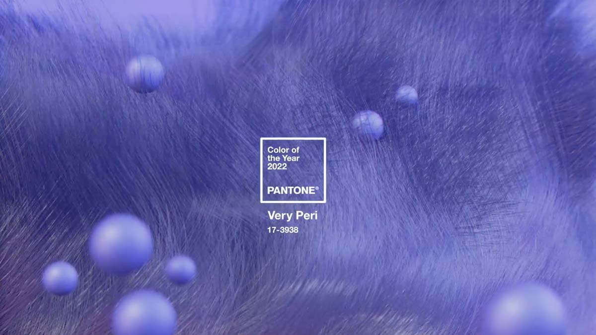
Very Peri is Pantone’s Color of the Year
Pantone, a world reference company known for its system of colors, widely used in the graphic industry, chose the color of the year 2022. It is Very Peri, a dynamic floral blue with an invigorating violet red undertone. The colors chosen annually become a world reference for stylists, advertisers, the commerce sector in general and especially for architects. According to the brand, the color represents the transformation that we are going through in our lives in recent years. “Very Peri, a dynamic floral blue with a lively red undertone, blends the loyalty and constancy of blue with an energetic violet red. A new Pantone color with an innovative and dynamic presence that encourages innovation and creativity. Very Peri (PANTONE 17-3938) helps us embrace the changed landscape of possibilities that open up to new vision as we rewrite our lives.” Colors have a real influence on people's lives.